The Gucci Logo is more than a stylish emblem; it’s a potent visual identity that captures decades of creativity, craftsmanship, and cultural influence. Born in Florence and expanded into the luxury fashion global markets, the logo represents the universal symbol of prestige. While trends were adapted through time, the rich heritage has remained intact. Many know it instantly, yet few understand how such a design journey reflects deeper brand values and changes in artistry.
In this deep dive, you’ll learn how the iconic branding, design structure, and cultural impact of the logo came to shape modern designer heritage. You’ll also study how historical decisions, creative risks, and brand storytelling guided its evolution. The result is a fascinating timeline connecting fashion history, visual communication, and global identity-making of the Gucci emblem surely one of the most influential symbols in the world.
Meaning of the Gucci Logo
The Gucci logo is one of the most powerful signs within the luxury fashion world. Its simple shape and bold look set it apart in every market around the world. Many people admire the logo without knowing the deeper story behind its design. The truth is that there are decades of history, family pride, and creative evolution behind the iconic interlocking letters. This story connects the past of the brand with the modern world of high-end fashion. The interlocking GG symbol reflects status, style, and a lasting heritage in every respect.
The Origins of Gucci and Its Early Branding Roots
Gucci actually started in 1921 when Gucci Gucci opened a small leather shop in Florence. Having worked in hotels, Gucci knew the taste of rich travellers. This background later shaped the identity of the brand. And the heritage brought by Gucci Gucci was a strong column for its design language. Even in the early years, the business focused on craftsmanship and Italian luxury. Buyers fell in love with the quality, and the name quickly drew attention in Europe. These early branding roots gave the future logo solid ground built on trust and elegance.
Before the famous emblem appeared, Gucci used handwritten signatures and simple stamps to mark their products. These marks told a story of authenticity but showed nothing of the dramatic boldness the brand would soon develop. As time progressed, customers learned to tie the name with fine materials, refined shapes, and high standards; these values helped shape what the luxury Italian fashion house would soon become across global markets.
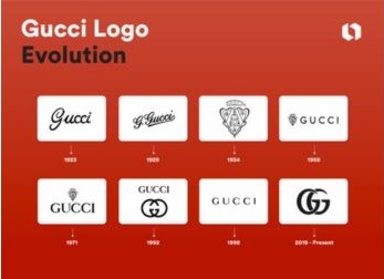
How the Gucci Logo Evolved from 1921 to Today
The Gucci logo has not looked the same since the beginning. In its early days, the brand implemented a quiet design style with no fixed symbol. When the business started to grow, the need for a clear visual identity became greater. Aldo Gucci, one of the sons of Gucci, presented the first version of the famous logo during the 1930s. Thus, this became the very beginning of the full Gucci logo evolution timeline-a journey of change that continues to date.
Over time, the design of the double G has been polished, refined, and adjusted to fit new trends. In the 1960s, it appeared in bold shapes, the lines softened by the 1980s, and sleek, modern forms in the 2000s. Each update kept the brand relevant but stood true to its core. The evolution demonstrates how a classic symbol can sustain decades of change without losing its core identity.
Important Events in the Gucci Logo Timeline
The Gucci logo timeline is filled with significant turning points. The introduction of the horse bit emblem, appearing on everything from bags to belts and shoes, was one huge moment. But while this wasn’t the company’s main logo, it helped reinforce the Gucci name in the luxury markets. Another major milestone came during the 1960s when the double G design started to widely appear on many handbags and accessories. This era made the double G monogram meaning more recognizable to fashion lovers.
The brand also made huge progress in the digital era. The logo became sharper and clean for online branding. Today, the symbol appears not only in stores but across social media, digital ads, and celebrity styling. A simple overview of how the logo took shape is shown in the timeline below.
| Year | Logo Development |
|---|---|
| 1921 | No formal logo, handwritten marks |
| 1933 | First interlocking GG introduced |
| 1960s | Widespread use on accessories |
| 1980s | Modernized print patterns |
| 2000s | Sleek, minimal digital-friendly version |
| Today | Global luxury icon |
Key Design Features of the Gucci Logo
The Gucci logo contains clean lines, bold symmetry, and strong visual balance. These features make it instantly recognizable at first glance. The most important element is the interlocking shape of the two G letters. This reflects both harmony and unity. Many of the luxury brands try to imitate such a style; however, the Gucci identity remains unique because of its simple yet powerful structure.
Another core design element is the use of contrast. Be it in gold, black, or silver, the graphic stands out on any surface. The spacing between letters, the thickness of shapes, and the smooth curves give the logo a feeling of timelessness. These choices strengthen its place in the luxury world, making it relevant for the young generations. Such a perfect balance in design can be achieved by mixing form, contrast, and tradition.
Symbolism and Cultural Influence of the Double G
The double G carries strong cultural meaning. To many individuals, it is perceived as a sign of wealth, taste, and success. This reputation has grown over decades through celebrities, global icons, and luxury buyers. The interlocking GG symbolizes fashion but most importantly aspiration. It connects the wearer with a world of style and class.
The meaning of the double G monogram also reflects family heritage. It gives respect to the founder, Gucci Gucci, by keeping his memory alive. This symbol respects tradition and embraces modern expression. The emblem can be seen in music videos, films, on the red carpet, and all major fashion magazines today. It is this cultural power that is pushing the brand into more recent audiences.
Surprising Details & Lesser-Known Facts About the Gucci Logo
Few people know that this famous logo was designed by a family member. The first official version was made by Aldo Gucci to honor his father’s name. This emotional connection gives a lot of meaning to the design. Another interesting fact is that early versions appeared only on luggage and travel goods. The fashion world later adopted the symbol and turned it into a global icon.
Another surprising detail is that the logo inspired full patterns that covered entire products. These patterns became one of the most popular designs ever in the brand’s history. The Gucci logo evolution timeline includes experimental shapes, rare prints, and limited editions that collectors value highly. These hidden stories help explain why the logo continues to attract attention after so many years.
Frequently Asked Questions About the Gucci Logo
One of the regular questions is, why did the brand use double G letters? The answer is very simple: it is Gucci Gucci, the name of the founder. Other frequent questions are, for example, if the logo has changed over time. The symbol has undergone several updates, but it has maintained its main concept. Other people may ask why this logo feels so luxurious. It is due to the strong identity created by clean lines and visual balance.
Many are also interested in where the monogram patterns originated from. These patterns were developed so that products would become instantly recognizable. They helped to establish a loyal customer following and furthered the brand with increased global power. These questions show how connected the symbol is with fashion culture and everyday style.
Lessons Brands Can Learn from the Gucci Logo
One of those lessons is consistency. Gucci changed its logo many times, but it always secured the heart of its design. That is the balance of change with tradition that has been a significant cause for its success. Other than that, one could also add storytelling. The heritage from Gucci Gucci gave an identity to this brand that buyers still believe in.
The emotional connection of the founder with the design is something wherein brands can also learn from. When a logo has meaning, customers relate to it. The success of Gucci also proves that simplicity can be powerful. A clean symbol often lasts longer than a complex one. These lessons help new brands understand the roots of strong visual identity.
Conclusion: Why the Gucci Logo Remains a Timeless Luxury Icon
The Gucci logo stands strong because it is an ideal blend of heritage and modern design. The shape, meaning, and story come together to complete the timeless luxury identity of the brand. The luxury Italian fashion house repeatedly reinvents itself, but the logo will always be familiar. This creates trust, admiration, and global admiration.
Ultimately, it is a symbol that reflects something bigger than fashion: history, family values, and a relentless drive for perfection. The ongoing metamorphosis of the logo reveals the path a brand can take to develop without losing its core spirit. That is why the Gucci emblem today stands among the most esteemed and coveted logos in the luxury universe.
Welcome to Outfiera.com. I’m Emaan Fatima, an AI-Powered SEO and content writer with 2 years of experience.

